Running a K-8 library is hard. It’s not the curriculum that’s difficult, or even the task of purchasing relevant and exciting texts for such a wide range of ages. Switching gears from 5th grade to kindergarten on a dime isn’t easy, but that’s not what I’m talking about. No, I’m talking organization. That’s the hard part.
Do you keep the picture books all together? Separate them by genre? Organize them by difficulty? Where can you point a second grader looking for books about princesses? How can you point a fourth grader, determined to read The Fault in Our Stars, to books more appropriate for their age? How do you keep a strong first grade reader with an older sibling from taking home The Hunger Games? Is there enough room on all of the shelves to keep the non-fiction in dewey decimal order? Should we keep all of the books about puppies together, even if their dewey classification isn’t side by side? And, most importantly, how do I make it all clear enough for my volun teers and patrons to know where their favorite books belong?
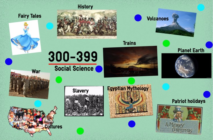
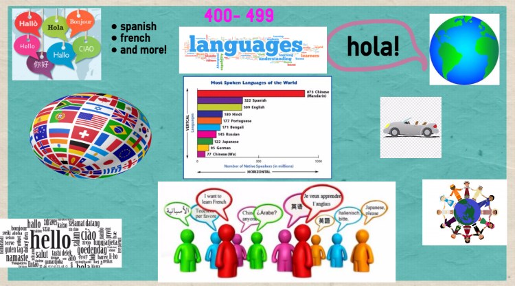
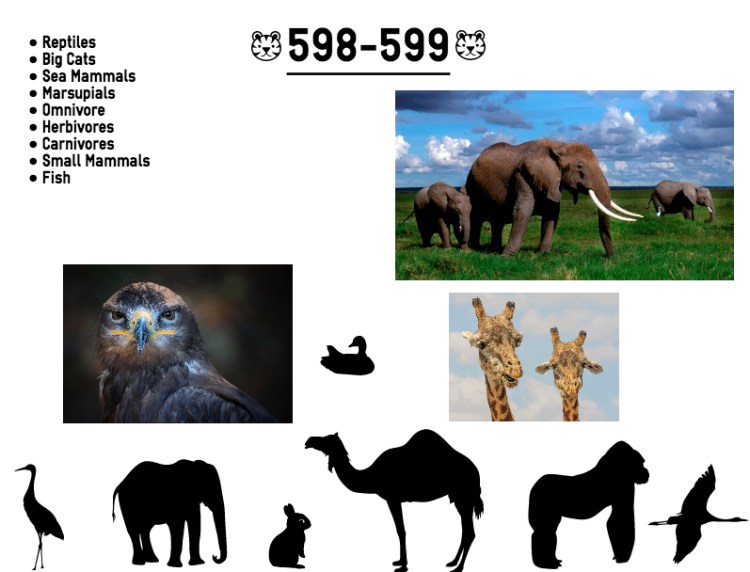
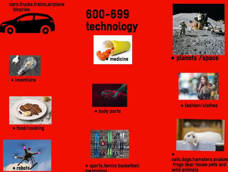
It’s not an easy job. And even after you find an organizational system that fits, a library is a living, breathing thing – it changes as your collection grows, the school’s curriculum changes, and the students’ needs change. What fits in 2006 doesn’t fit in 2016. It’s a constantly evolving process. At St. Anne’s-Belfield, our non-fiction section is particularly intimidating. The section snakes around the big, beautiful space in a pattern that seems nonsensical to the untrained eye. Wild animals have their own spot, as do fairy tales and biographies. Some shelves are low, and others are high. In other words: if you don’t know exactly where to look, you’re out of luck; and I wanted that to change. And so a few weeks ago, I posted a Help Wanted ad.
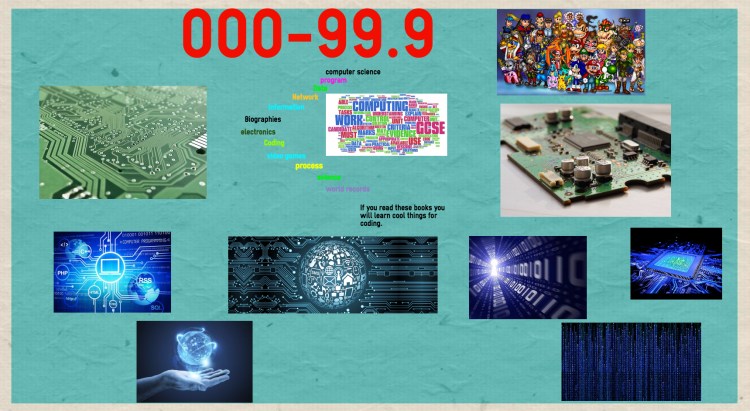
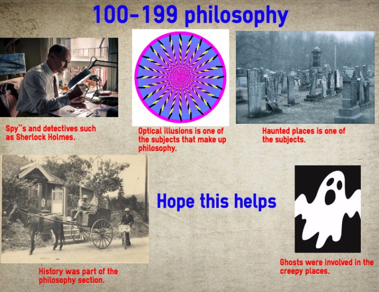
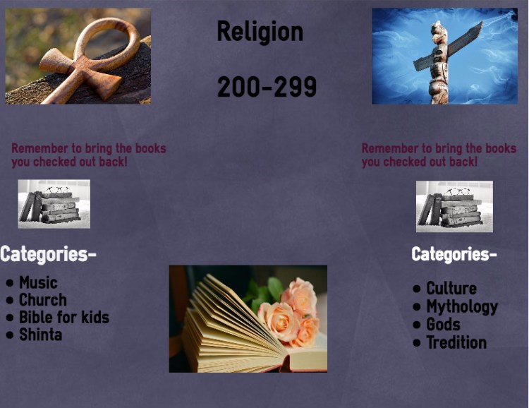
 Luckily, fourth grade was on the job. We met and started with the first step of the design thinking process – empathy. What would cause younger or new readers trouble when attempting to navigate our library? How could we help to make it and easier and more fun process for them? From there, it was time to research. Why are books broken into these Dewey Decimal sections, anyway? Why are the robots so close to the pets? What do the numbers mean? How many topics are in each section, and how are they organized? From there, we decided what we needed to do – create colorful, easy-to-understand signage that could help both readers and non-readers find their favorite books.
Our next step was to study infographics. What makes a good infographic? What happens if you add too much text? Too many pictures? How much information should one page hold? What makes an infographic fun to look at? What is the best way to get your message to your audience? After a lot of drafting and research, we were ready to design. Using the online graphic design tool Easel.ly, we worked with Ms. Mathieson to understand the basics of graphic design. From there, I gave it to them straight – I was looking to hire help, and not everyone was going to get the job. They needed to focus, collaborate, and put their best effort in if they wanted to be hired. And then, I sat down and let them work.
Over the course of the next month, I watched these design beginners grow into Easel.ly  experts. They knew more about how to use the site within one 40 minute work session – when one team had a question, instead of attempting to answer it, I simply quieted the group and asked for an expert. While I watched, they typed and re-sized and centered and uploaded. Earlier this week, it was time for job interviews. Each duo pitched their artwork to another group while I walked around, listening. Then out of each class, I chose three pitches that I wanted to hear in more detail. These groups shared their projects with the class, and received questions and feedback from the whole group. While the presentations were excellent, the feedback was also surprisingly good – even though the project was over, the design thinking was still in place. “Why didn’t you center that text?” one fourth grader asked a pair of partners. “I like how you used all capital letters,” another commented. “Using the same font all over the poster really made it all go together.”
Hopeful applicants left for Thanksgiving break without knowing who was hired. They’ll find out who was chosen when they come to library class this week to see their work printed, laminated, and displayed in the library. Butttttttt just in case you’re like me and you can’t wait that long, follow the jump below to see the winning graphic design work.
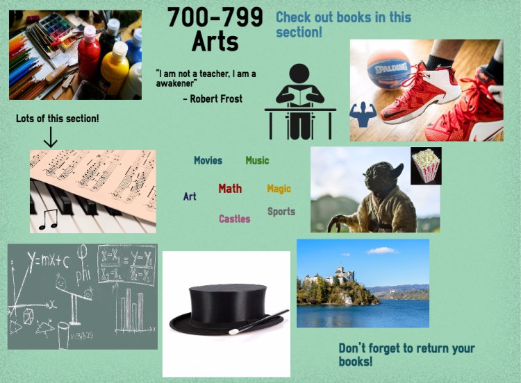
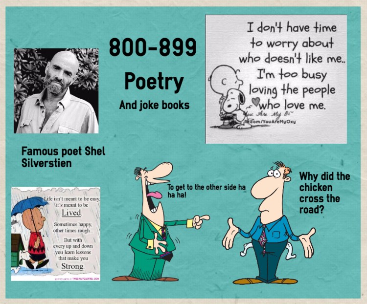
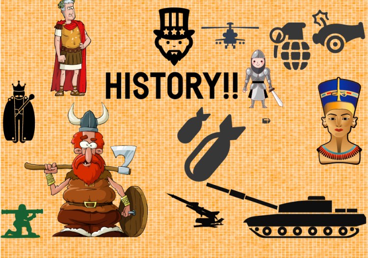
Congratulations on all of your hard work, fourth grade! You blew me away with your final products. I am proud to display your artwork.


This is an awesome idea! Thank you for sharing. I am going to use this for my middle school students.
LikeLike
Thank you! I hope you enjoy it as much as we did. If you ever want to collaborate or have classes pitch to each other over Skype, let me know! That could be a fun extension activity 🙂
LikeLike